

The Secrets To Choosing Balloon Colours That Wow Everyone
16
Sep
Sep
Balloon art is a fascinating combination of creativity and craftsmanship. Beyond just twisting and inflating balloons, one of the most powerful ways to elevate your balloon designs is by mastering colour harmony. The right mix of colours can transform your balloons from simple decorations into eye-catching centrepieces that truly pop. Whether you’re a seasoned balloon artist or just exploring fun DIY decor ideas, understanding how to harmonise colours will take your balloon creations to the next level. Let’s dive into some practical tips and insights on balloon colour mixing that will boost your decor game.
A brief introduction to colour theory
Before you start grabbing balloons, it’s helpful to brush up on some basic colour theory. This foundational knowledge will guide your decisions and help you create colour combinations that not only look good but feel balanced and intentional.
At the heart of colour theory is the colour wheel, a visual tool that shows how all the different hues relate to each other. The wheel is divided into primary, secondary, and tertiary colours:
- Primary colours: Yellow, blue, and red. These are the base colours you can’t create by mixing others.
- Secondary colours: Green, orange, and purple, which you get by mixing two primary colours.
- Tertiary colours: These are blends of a primary and a secondary colour, resulting in hues like red-orange or blue-green.
Building on these basics are important colour relationships you should know:
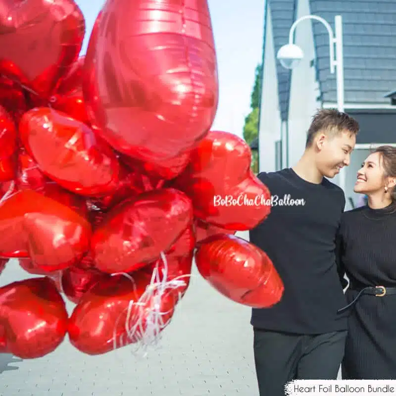
- Complementary colours: These sit opposite each other on the wheel. Think red and green or blue and orange. Using these pairs together creates high contrast and vibrant energy, perfect for bold designs.
- Analogous colours: These colours are neighbours on the wheel, such as blue, teal, and green. They harmonise naturally and produce serene, cohesive looks.
- Triadic colours: This scheme involves three colours spaced evenly around the wheel, for instance, red, yellow, and blue. Triadic palettes are balanced but lively, providing great versatility.
Understanding these relationships helps you pick balloon colours that either blend smoothly or create striking contrasts depending on what mood or effect you want.
Tips on how to choose balloon colours for your decor
Now that you have a grasp on the basics, let’s talk about how to build a stunning colour palette for your balloon decor:
1. Choose the right colour scheme
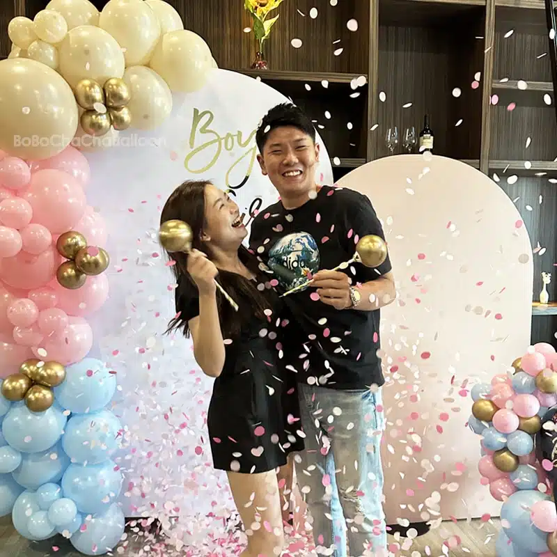
Starting with a well-defined colour palette or theme is crucial. This palette should typically include two to four main colours that will thread throughout your decor, from balloons and florals to table settings.
When deciding on your palette, keep these questions in mind:
- What’s the event’s vibe? For example, an elegant wedding calls for soft, classic colours, while a kid’s superhero party might be more vibrant and eclectic.
- What time of year is it? Seasonal colours add contextual harmony – think pastel shades in spring or jewel tones in winter.
- What’s your personal style? Are you going for whimsical, rustic, modern, or glamorous?
Once you pinpoint your core colours, select balloon hues that complement these tones for a polished, unified look.
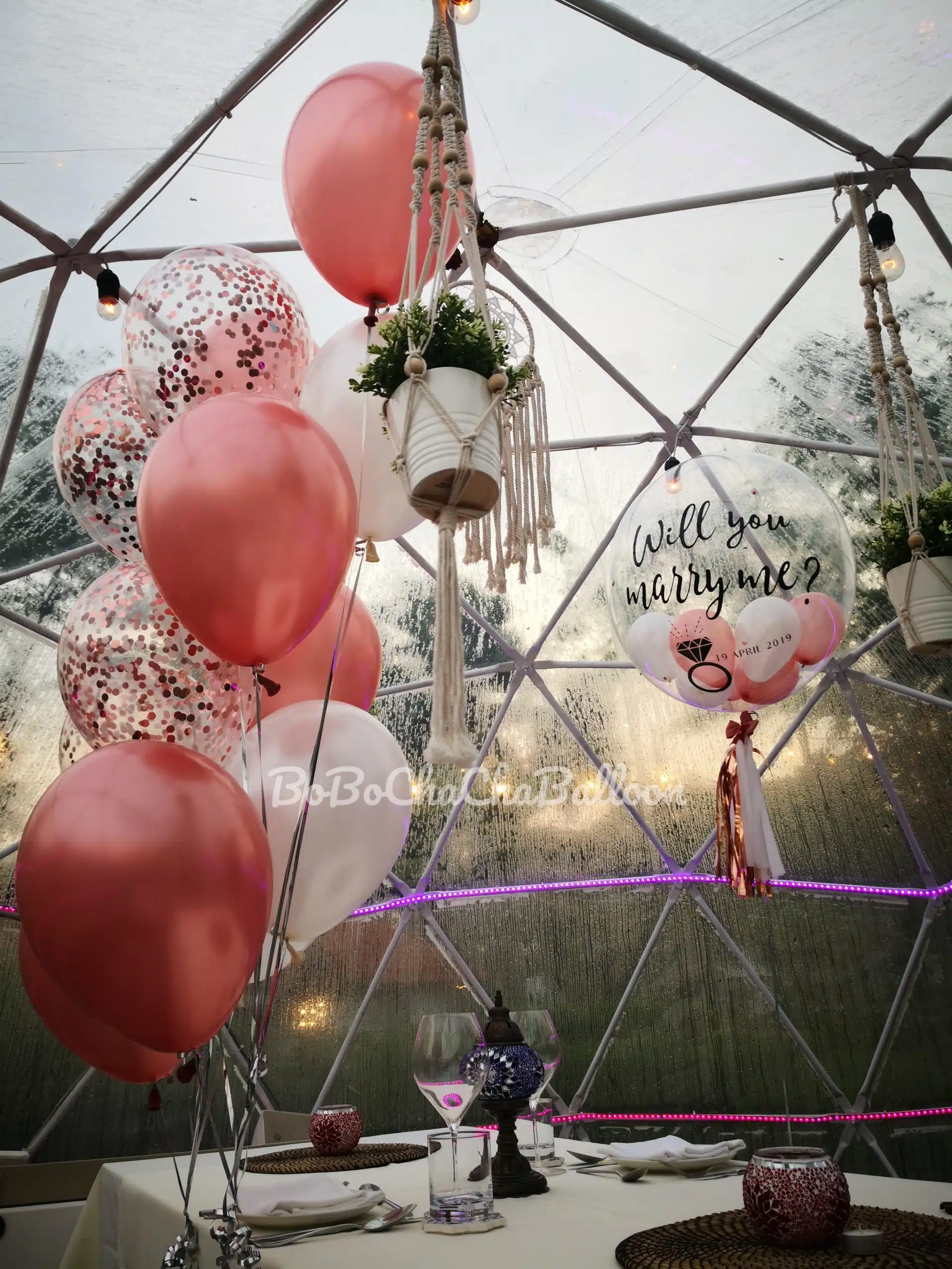
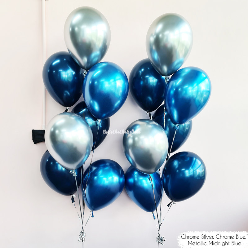
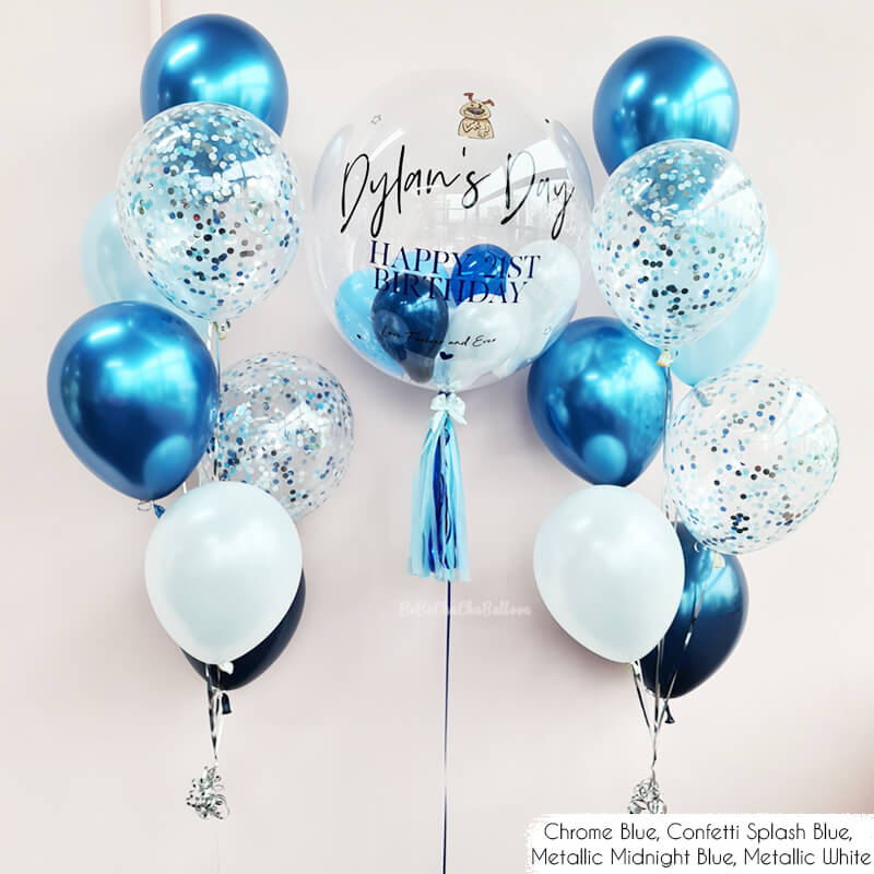
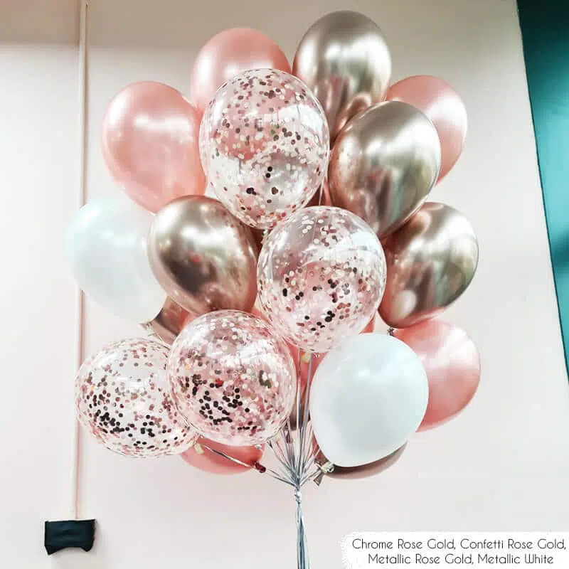
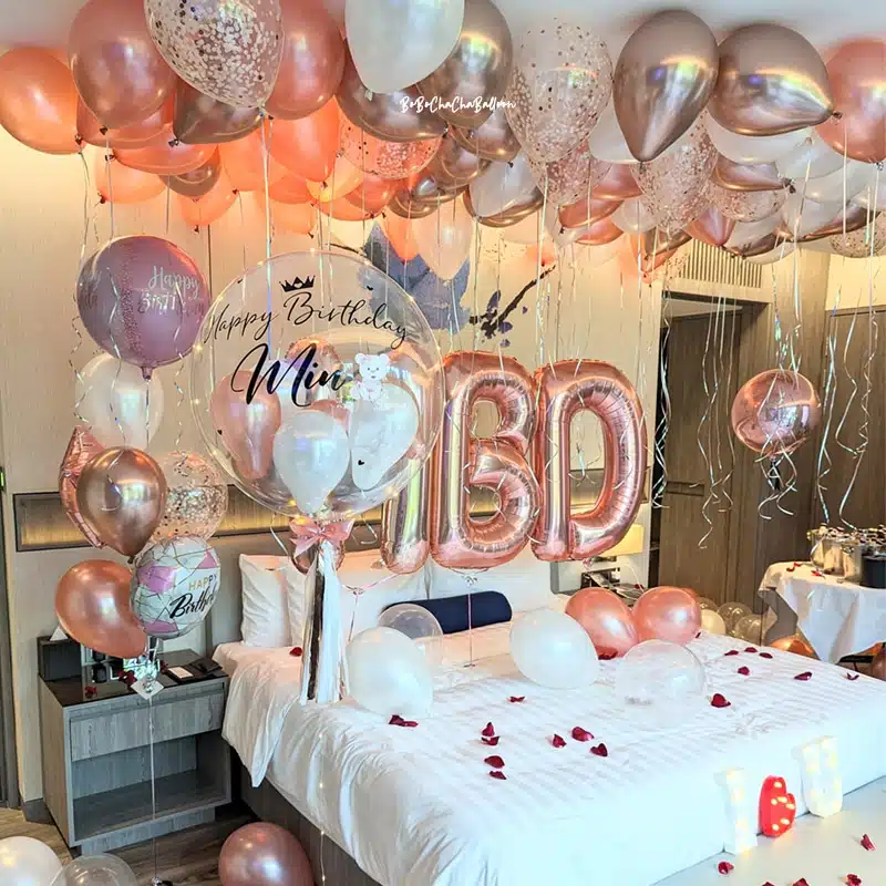
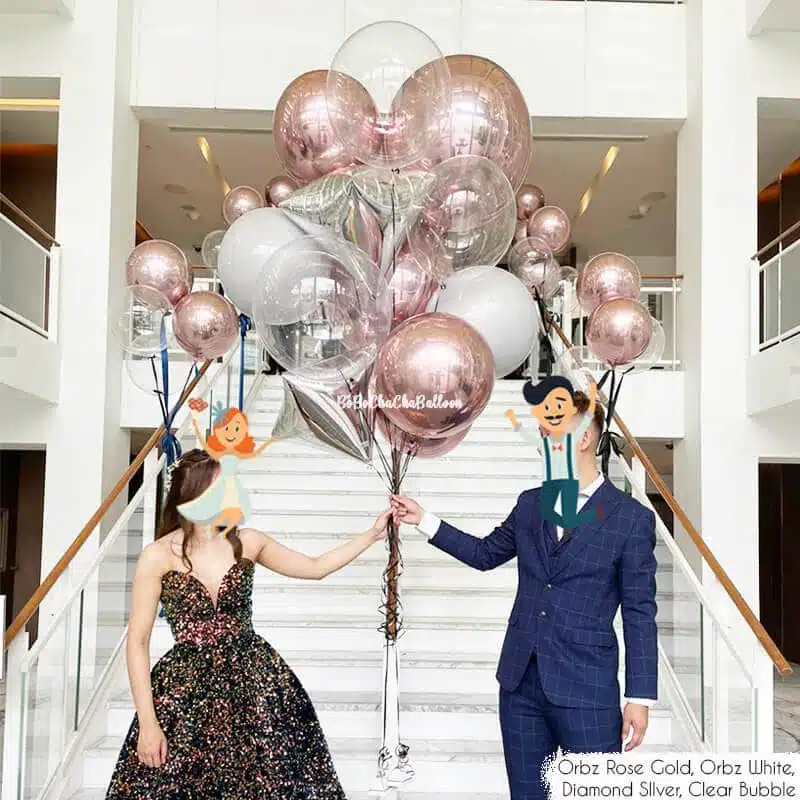
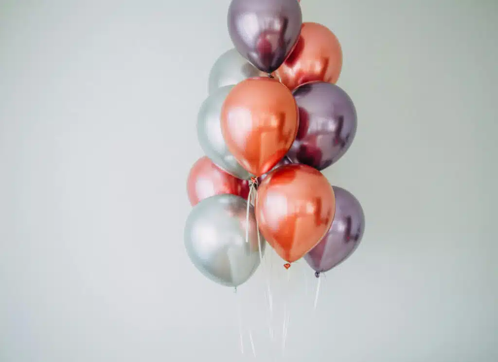
2. Incorporate and experiment with metallics and gradient effects
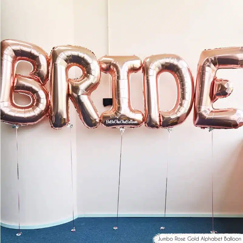
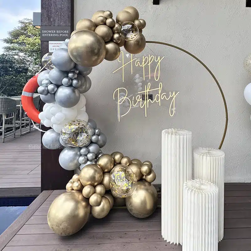
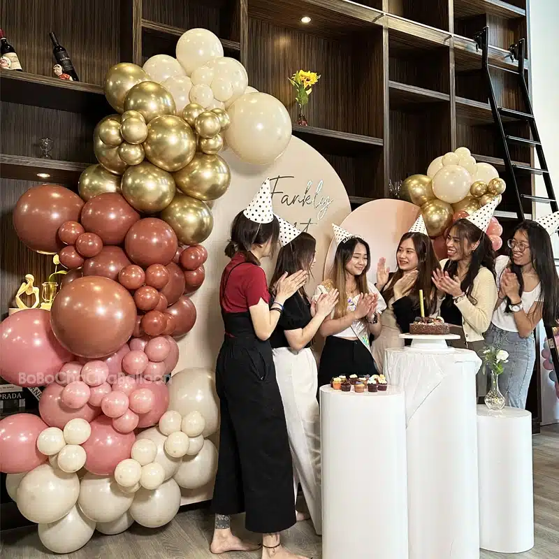
To add sophistication, consider metallic balloons in shades like gold, silver, or rose gold. Their shimmer brings a luxe vibe, perfect for formal settings such as corporate events or New Year’s Eve parties.
You can use metallics as accent colours to highlight certain clusters or create perfectly balanced arches, or as part of the main palette. For example, a navy, blush, and rose gold combo can look stunning, with metallics accentuating larger balloon structures. Just remember: metallics can be overpowering if overused, so sprinkle them in thoughtfully.
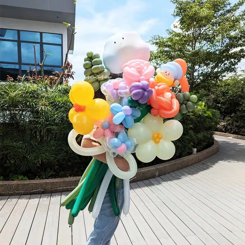
Gradients also inject gorgeous depth into your displays. This technique uses several shades of the same colour, arranged from the lightest to the darkest. Think of a gradient from pale pink to deep fuchsia for a romantic feel. Gradients provide smooth transitions between hues, especially effective on large installations like arches or columns.
For the best effect, use at least three shades for seamless blending. The result is a visual journey pleasing to the eye that elevates your setting’s aesthetic.
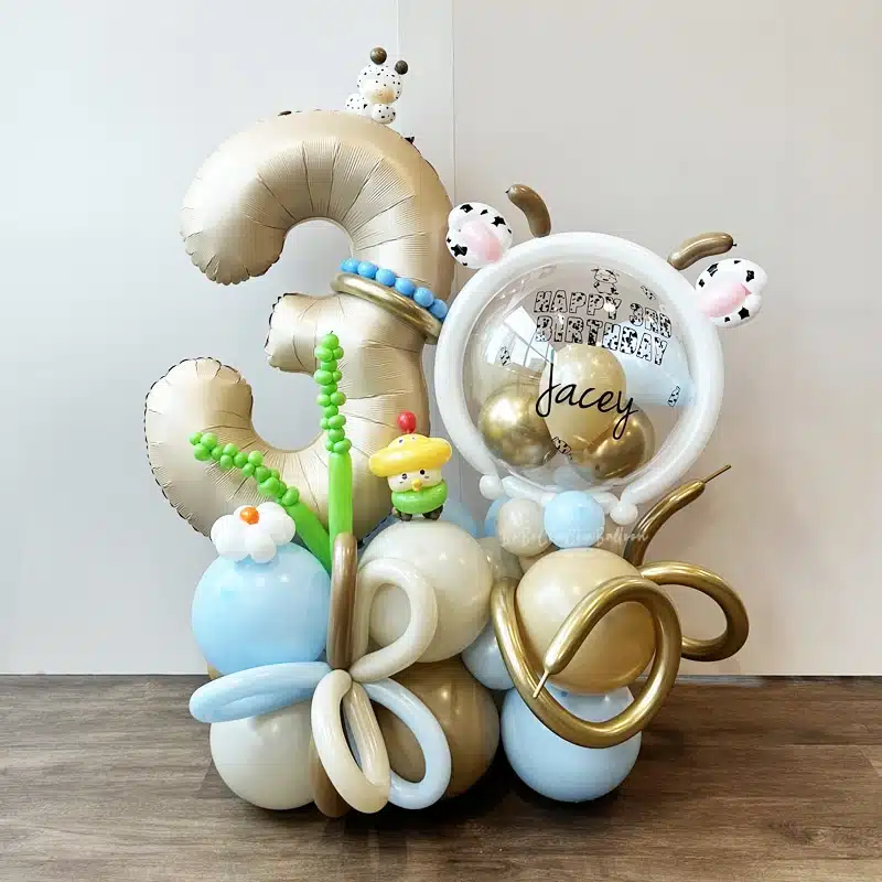
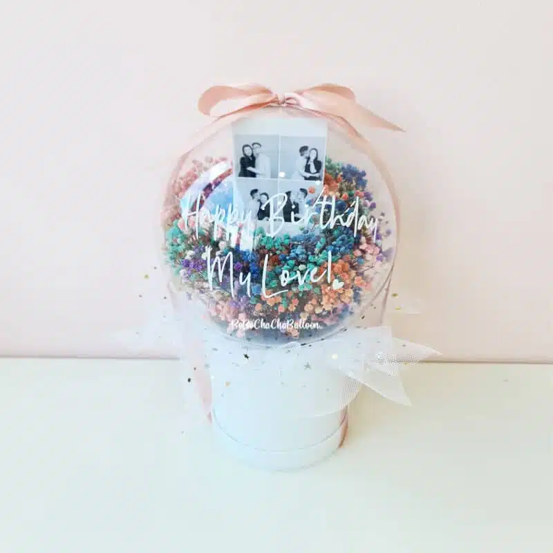
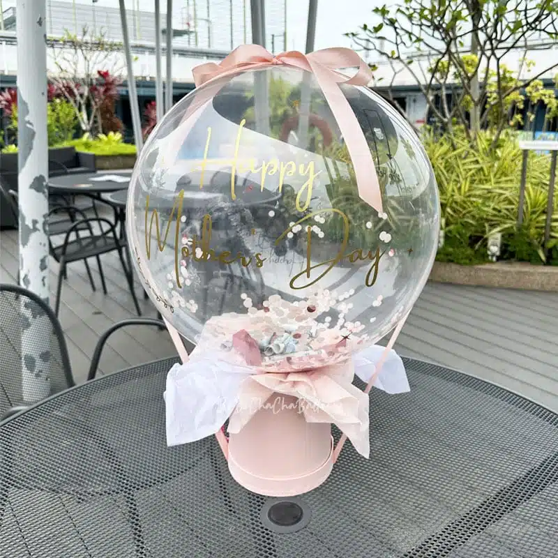
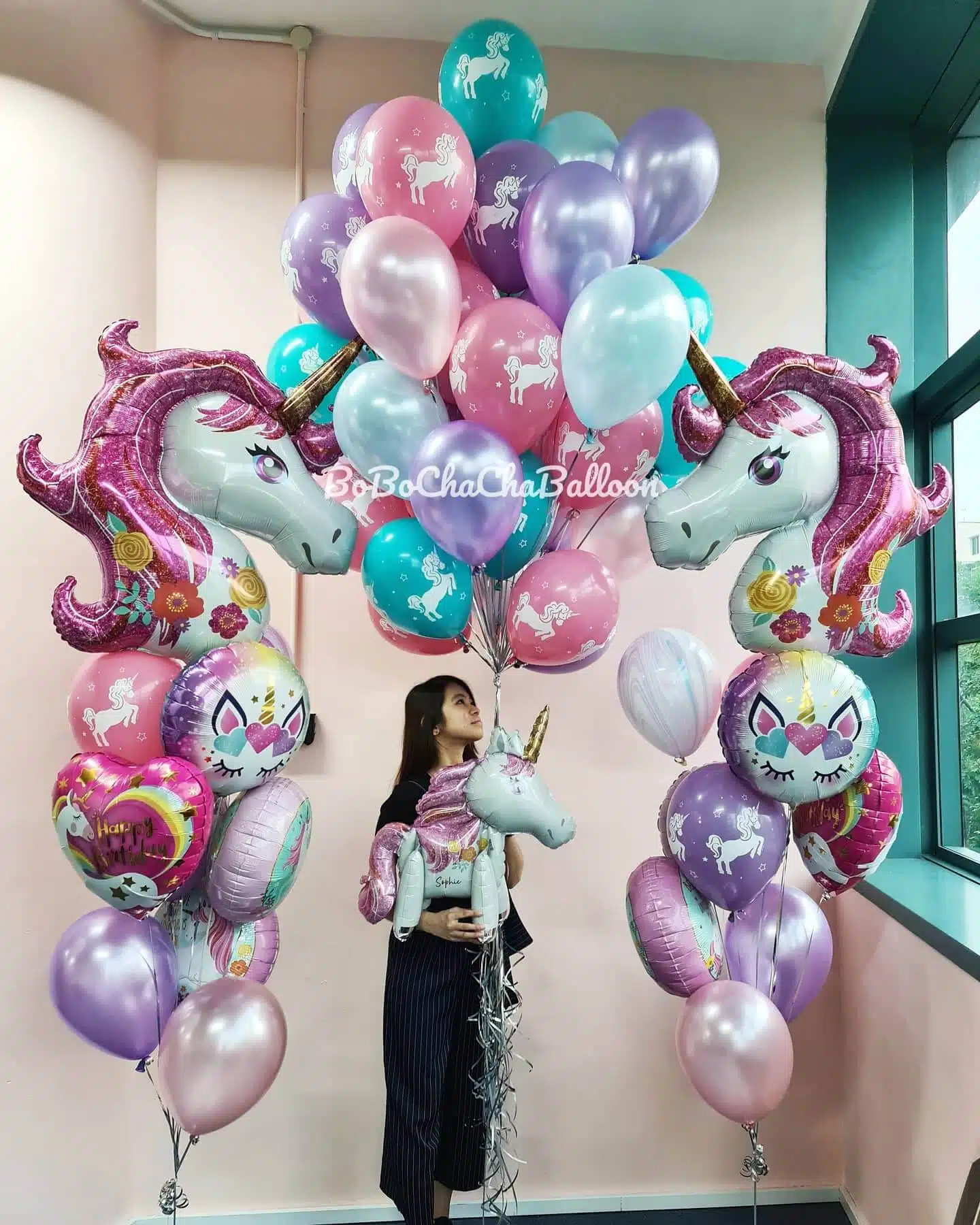
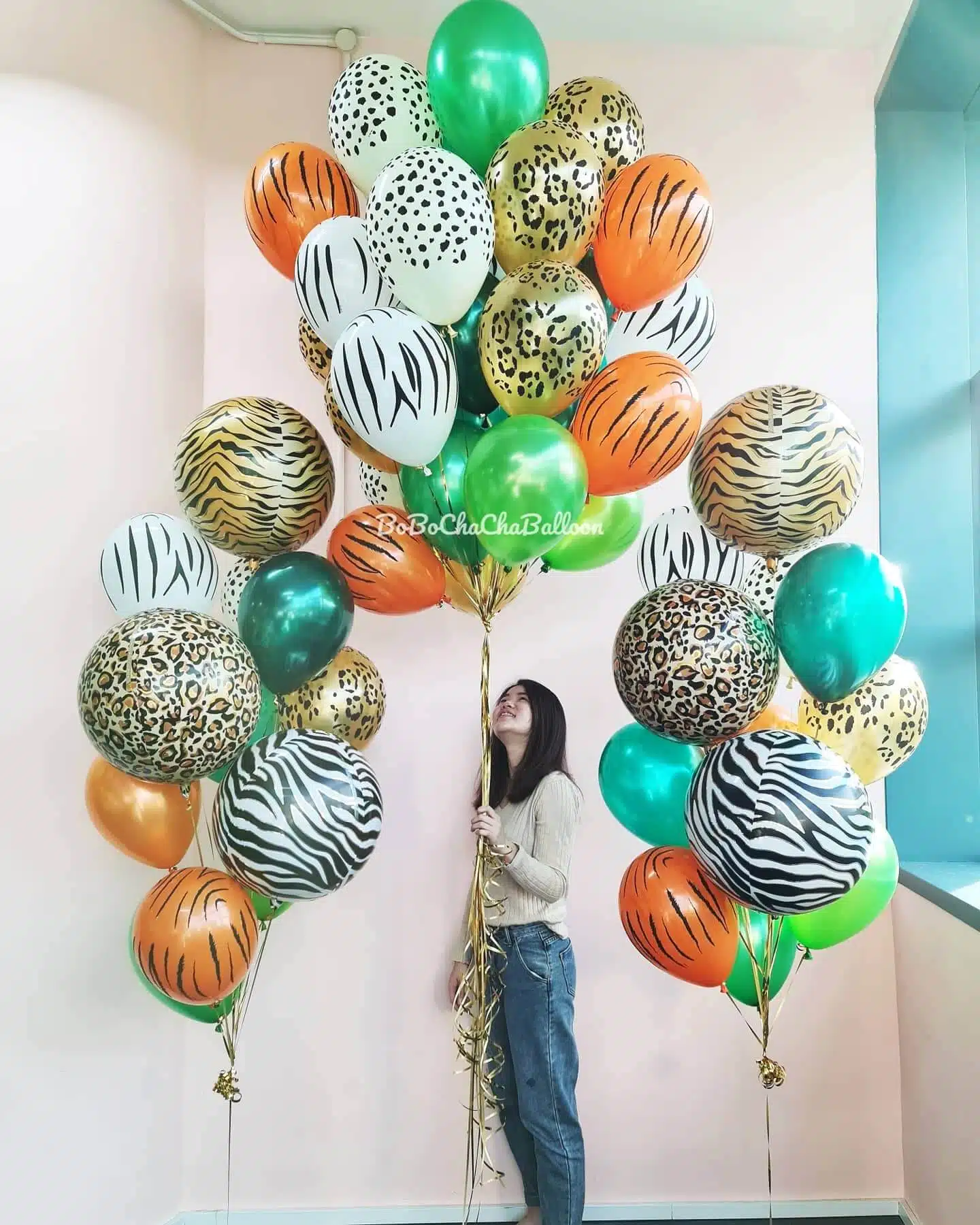
3. Mixing solid and printed balloons
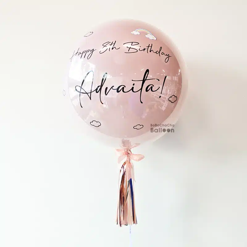
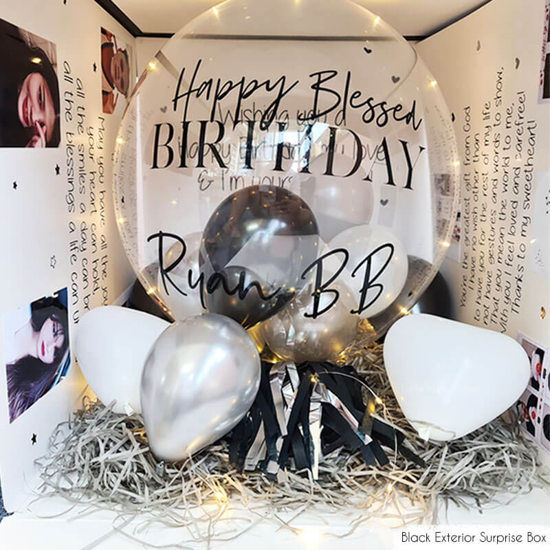
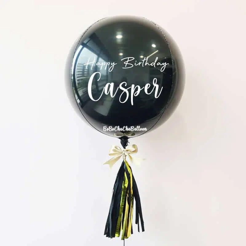
Another way to make your setup stand out is by combining solid-coloured balloons with printed or patterned varieties. Printed balloons come in all sorts of designs, from classic polka dots and stripes to florals and abstract prints. You can even order custom helium balloons printed with messages or logos.
Make sure the patterns match your overall colour scheme to keep everything cohesive. For instance, if you’re working with mint, peach, and white, try using solid mint and peach balloons with white ones that feature delicate floral prints. Layering different balloon types and sizes is a fun technique for creating dimensional backdrops or installations. Just aim for a balanced mix so one element doesn’t overshadow another.
4. Consider balloon finishes
Colours aren’t the only factor to take into account, as balloon finishes also greatly influence a display’s vibe. Here are some popular types:
- Matte: Soft, understated, perfect for rustic or vintage events.
- Glossy: Shiny and reflective, adding energy and brightness.
- Metallic: Glamorous and sparkling, ideal for formal occasions.
- Pastel: Light, airy, and delicate, great for baby showers or spring events.
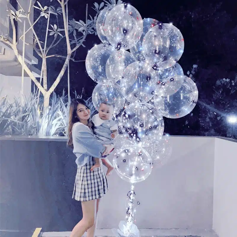
- Crystal (clear): Glass-like and elegant, providing a modern touch.
Choosing finishes that match your event’s tone helps tie everything together. You can also combine finishes for added texture. For instance, pairing matte and metallic balloons in complementary colours adds visual interest.
5. Tap into colour psychology to evoke emotions
It is well known that colours can influence how people feel. Using colour psychology in your balloon decor can set the right mood and leave a memorable impression.
- Warm colours like red, orange, and yellow energise and stimulate, sparking excitement, which is perfect for lively parties or celebrations.
- Cool colours such as blue, green, and purple calm and relax, creating a peaceful atmosphere for intimate affairs or tranquil settings.
By choosing balloon colours that align with your desired emotional impact, your decor will do double duty: look stunning and enhance the event experience.
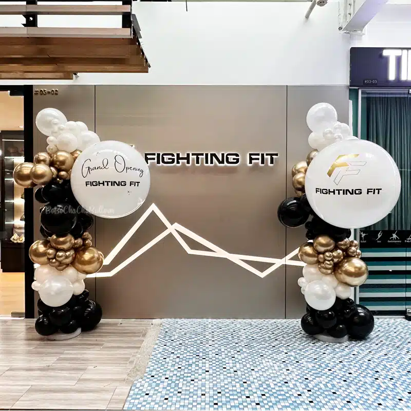
6. Use the 60-30-10 rule for balanced colour distribution
A classic design trick to keep your decor balanced is the 60-30-10 rule. It suggests that:
- 60% of your colour scheme should be a dominant hue.
- 30% should be a secondary colour.
- 10% should be an accent.
This ratio helps create visual harmony and prevents colour overload. For instance, at a corporate event, you might have the company’s main colour dominate (60%), a neutral colour like white or grey fill 30%, and a metallic gold accent the last 10%. Following this rule keeps your balloon display polished and easy on the eyes.
7. Take inspiration from nature
Nature offers an endless palette of delightful colour combinations that work beautifully in balloon decor. Look around outdoors to spark your creativity.
- A sunset-inspired scheme might blend warm oranges, pinks, and purples.
- An ocean theme could feature various blues, seafoam greens, and sandy neutrals.
- Forest motifs lean into greens, browns, and floral bursts.
These natural palettes feel organic and inviting, making them especially good for outdoor or nature-themed events.
8. Consider advanced techniques used by professional balloon artists
For those wanting to up their game, here are two advanced colour techniques you can try:
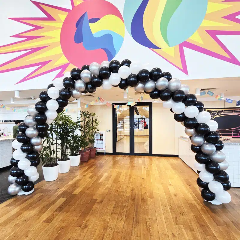
- Colour blocking: This involves grouping balloons by solid blocks of colour. It’s great for large-scale designs like balloon walls, where contrasting blocks create bold, contemporary visuals.
- Ombre effects: Similar to gradients, ombre involves blending one colour smoothly into another across your design. It lends a soft, polished sophistication that makes any event pop.
Mastering these effects requires practice, but can elevate your balloon decor from great to unforgettable.
Conclusion
Achieving colour harmony in balloon decor doesn’t have to be intimidating. By keeping the tips above in mind, you’ll create balloon art that’s visually stunning and perfectly suited to your event’s vibe. Whether you favour calm and muted tones or vibrant contrasts, the key is to be intentional with your colour mixing. So the next time you’re tasked with transforming a space with balloons, remember: it’s all about balance, emotion, and creativity. With these tips under your belt, you’re ready to make every balloon display a harmonious, show-stopping masterpiece.
Turn any occasion into a celebration with BoBoChaChaBalloon. From chic helium bundles to show-stopping balloon setups, we’ll help you create a space that dazzles. Let’s start planning your perfect party today!